Overview
An accessibility-first redesign, launched May 2023.
The objective was to design an accessibility-responsive, mobile-first website for Gong cha, an international franchise brand specializing in the highest-quality tea — a site accessible to the general public regardless of physical or cognitive abilities. Accessibility is also good business: it expands audience reach, boosts brand image and customer loyalty, and mitigates legal risk.
To investigate how visually impaired users navigate with screen readers, we conducted thorough user research following the User-Centered Design process — five 1-on-1 interviews with subject-matter experts, visually impaired individuals, franchisees and milk-tea buyers, plus 39 survey responses. Five personas guided the work: visually impaired users, tea enthusiasts, potential franchisees, event/wedding planners, and job seekers.
Problem
A site screen readers couldn’t parse — text baked into images, a carousel keyboards couldn’t reach, and 85% of visits arriving on mobile. Inaccessibility meant lost customers and legal risk.
Approach
Accessibility-first and mobile-first — research with visually impaired users (five interviews, 39 surveys, five personas) shaping 50+ WCAG-aligned, SEO-optimized pages.
Results
+251% sessions and −87% bounce rate in three months; the accessibility score climbed from 56% to 88%.

Recognized with the Silver A’ Design Award in Website and Web Design, 2023–2024 — awarded to the top 5% of entries worldwide. Official winner page ↗
Research
Five interviews, 39 surveys, five personas.
Four goals framed the research: understand what users come to do, evaluate the existing experience, align the site with WCAG 2.0, and lift search rankings. Five 1-on-1 interviews (subject-matter experts, visually impaired users, franchisees and milk-tea buyers) and 39 survey responses were synthesized into five personas — and every finding was tested hands-on with the NVDA screen reader and tracked in SEMrush.
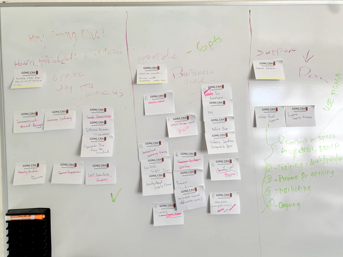
Visually impaired users want to browse and order independently with a keyboard and screen reader. Their four blockers shaped the whole redesign:
- The rotating banner moved on before a screen reader could finish it, and the keyboard couldn’t reach the next or last slide.
- The store map’s dropdown filters couldn’t be operated by keyboard at all.
- Ordering silently redirected to a third-party delivery site — no warning, no way back.
- Color contrast was too low for users with color blindness.
Tea enthusiasts want hours, seasonal drinks, rewards and nutrition/allergen facts — but a name and a photo were all a drink got. Potential franchisees want transparent costs and process; hidden fees and thin support are their deepest fears. Event & wedding planners need to compare catering options and couldn’t tell what each package includes. Job seekers look for openings at nearby stores and clear hiring steps.
Information Architecture
From affinity map to 50+ pages.
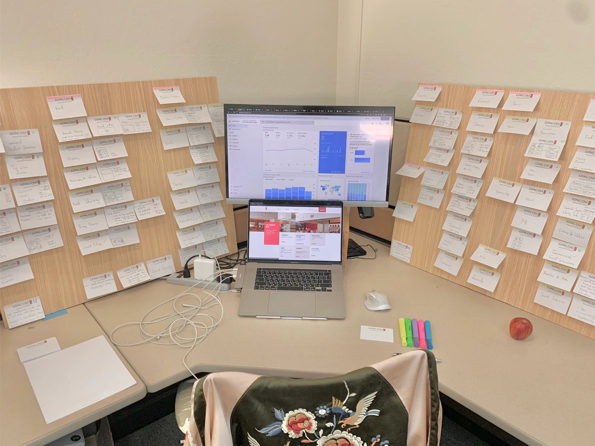
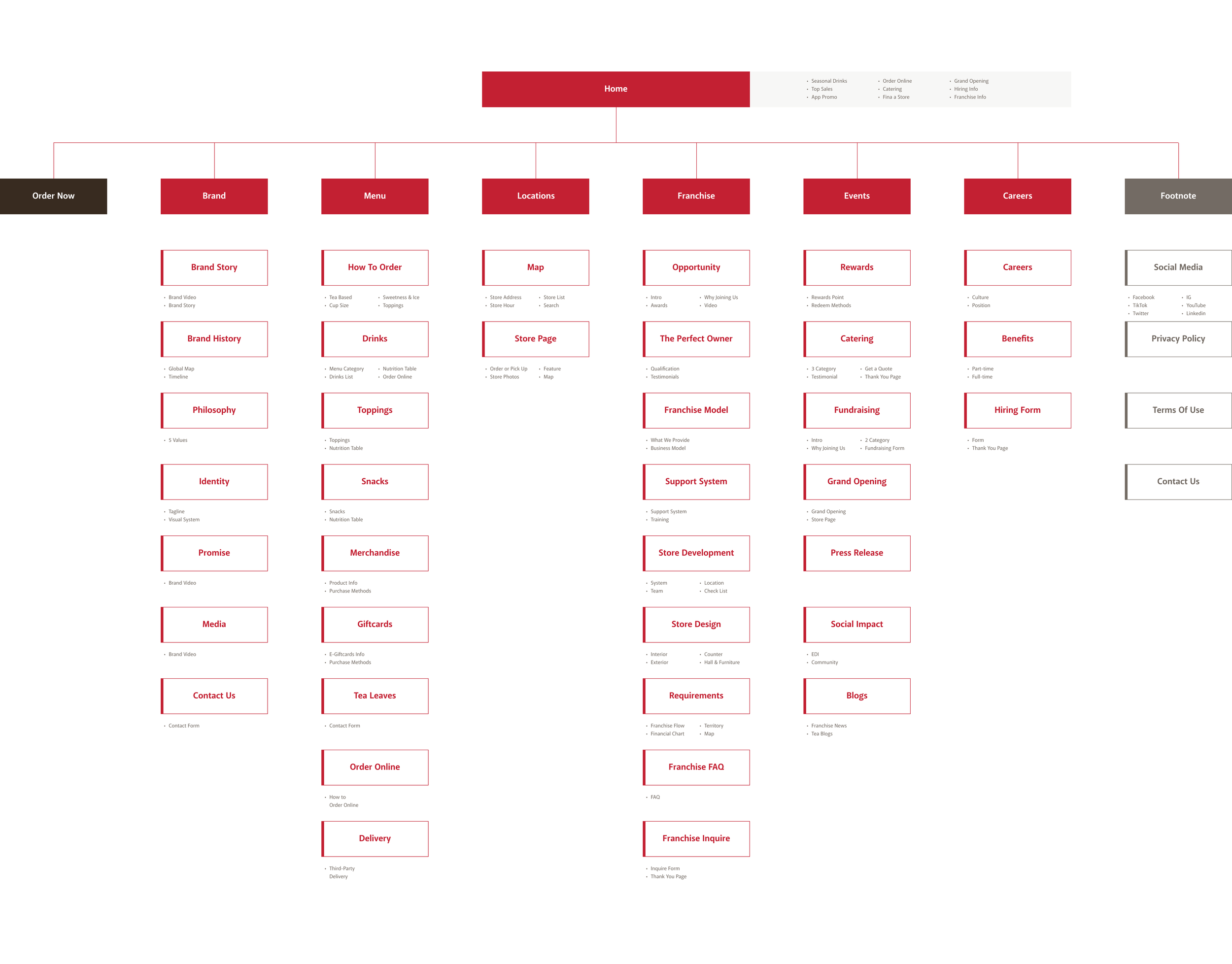
Synthesis turned interviews directly into structure. For the franchise section alone, nine decision factors surfaced in franchisee and expert interviews (brand awareness, financials, training and more) were affinity-mapped into nine pages, from industry introduction to application form. Sitewide, the same method organized six visitor goals — Brand, Menu, Locations, Franchise, Events and Careers — into a 50+ page sitemap.
Key Decisions
Five pages, five accessibility decisions.
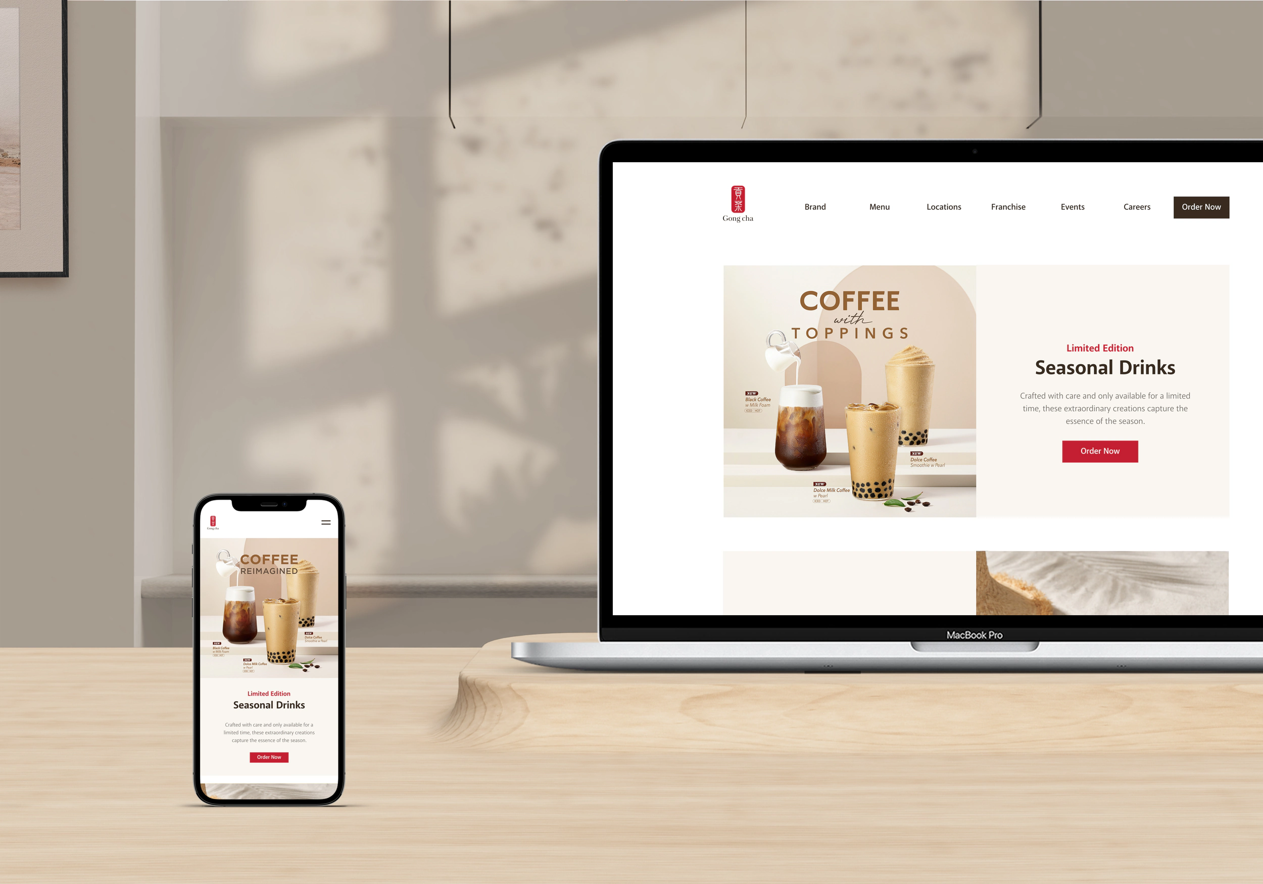
Landing — the rotating banner moved on before screen readers could finish reading it and trapped keyboard users, while 85% of visits were mobile. Solution: mobile-first — remove the carousel, move content into the scroll, and enforce color contrast, scalable type, alt text, forms with clear error messages, and captioned media throughout.
Brand — Gong cha still lacked brand resonance with American audiences, and Asian cultural elements in the identity widened the gap. Solution: a comprehensive brand page — story, history, global expansion, identity system, philosophy and commitment, with a contact form.
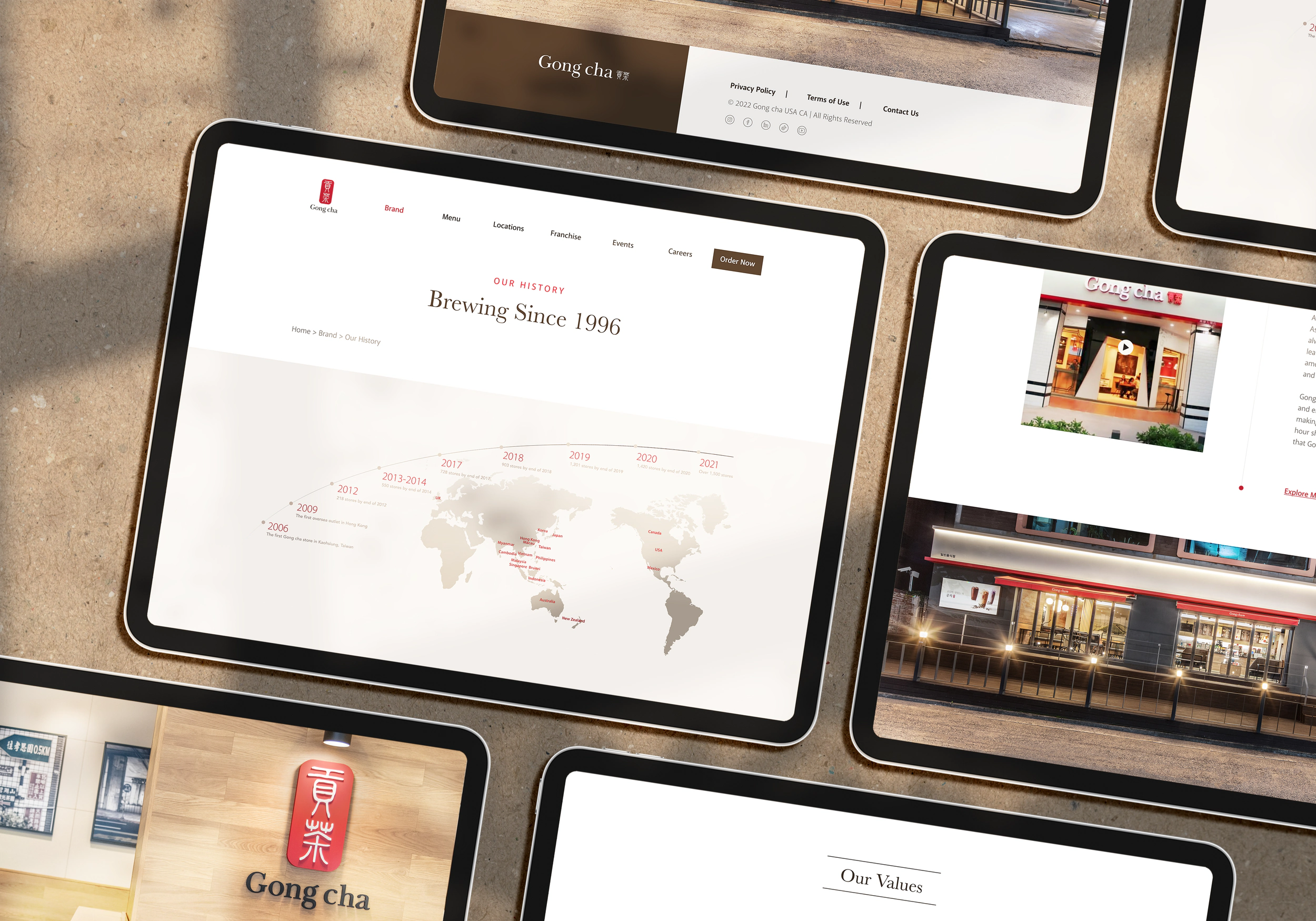
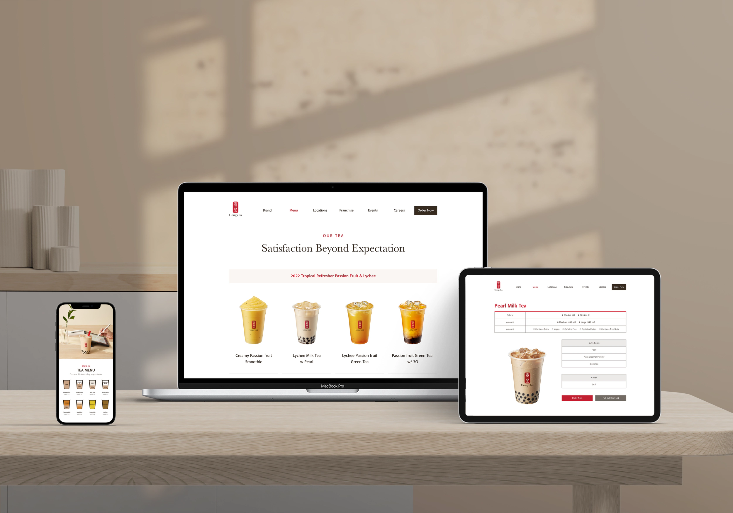
Menu — text baked into images was invisible to screen readers, and customers new to bubble tea didn’t know how to order. Solution: real web text with descriptive metatext instead of text-on-image; calorie, ingredient and allergen info; and a step-by-step visual “How to Order” guide.
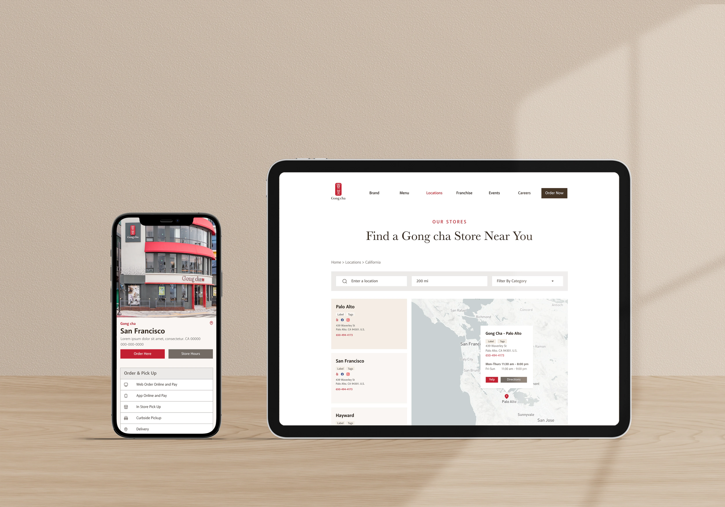
Locations — “Gong cha near me” ranks among the top queries, and one page serves four audiences: tea drinkers checking hours and delivery, franchisees gauging store-to-store distances on the map, planners scoping catering, and job seekers hunting openings. All that density came at a cost — the map’s dropdowns and filters stalled screen readers. Solution: dedicated per-store pages with photos and full details, and streamlined or removed filters.
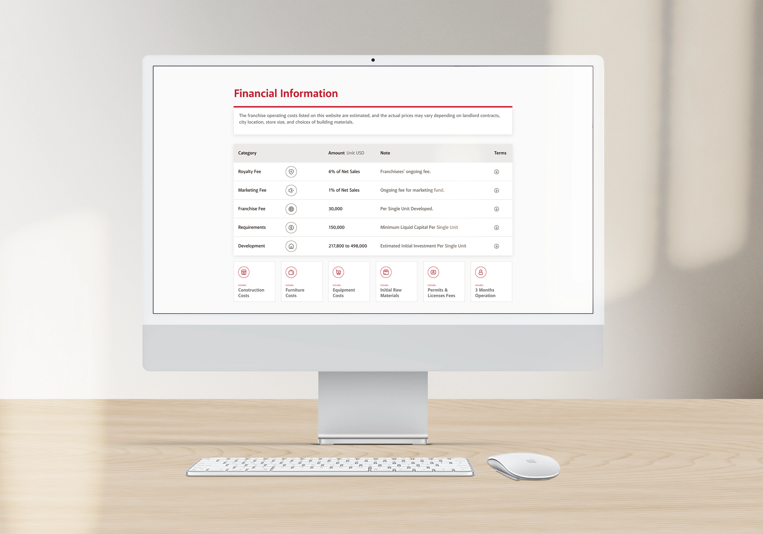
Franchise — the nine-page structure came straight from the affinity map above; the content depth came from the field: an SME interview with Gong cha’s event manager revealed how weddings, schools and fundraisers actually order catering, so a catering inquiry form gives staff early insight into events and improves conversion.

Of the nine decision factors, financials weighed heaviest — so franchise costs became a transparent, itemized table instead of a brochure PDF.
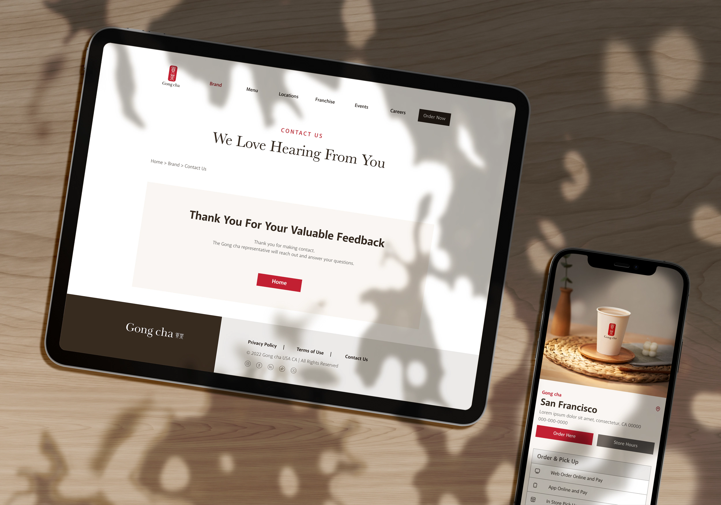
And because accessible forms are only half the loop, every submission ends in a clear confirmation.
Results
Three months in, the numbers spoke.
The redesign launched 50+ SEO-optimized, accessible pages. Per Google Analytics and SEMrush: sessions +251.69%, first-time users +280.51%, bounce rate −87.64%, page views +44.69%; CTR rose from 1.28% to 2.80% (+119%); search visibility jumped from 19.62% to 44.40%; mobile responsiveness alone drove a 34% traffic boost.
Accessibility went from claim to number: the SEMrush score climbed from 56% to 88% after fixing over 150 violations — well clear of the 75% line below which sites face legal exposure in markets like Ireland.
+251%
More sessions
Google Analytics, post-launch
+119%
CTR improvement
1.28% → 2.80% in three months
88%
Accessibility score
SEMrush, up from 56%
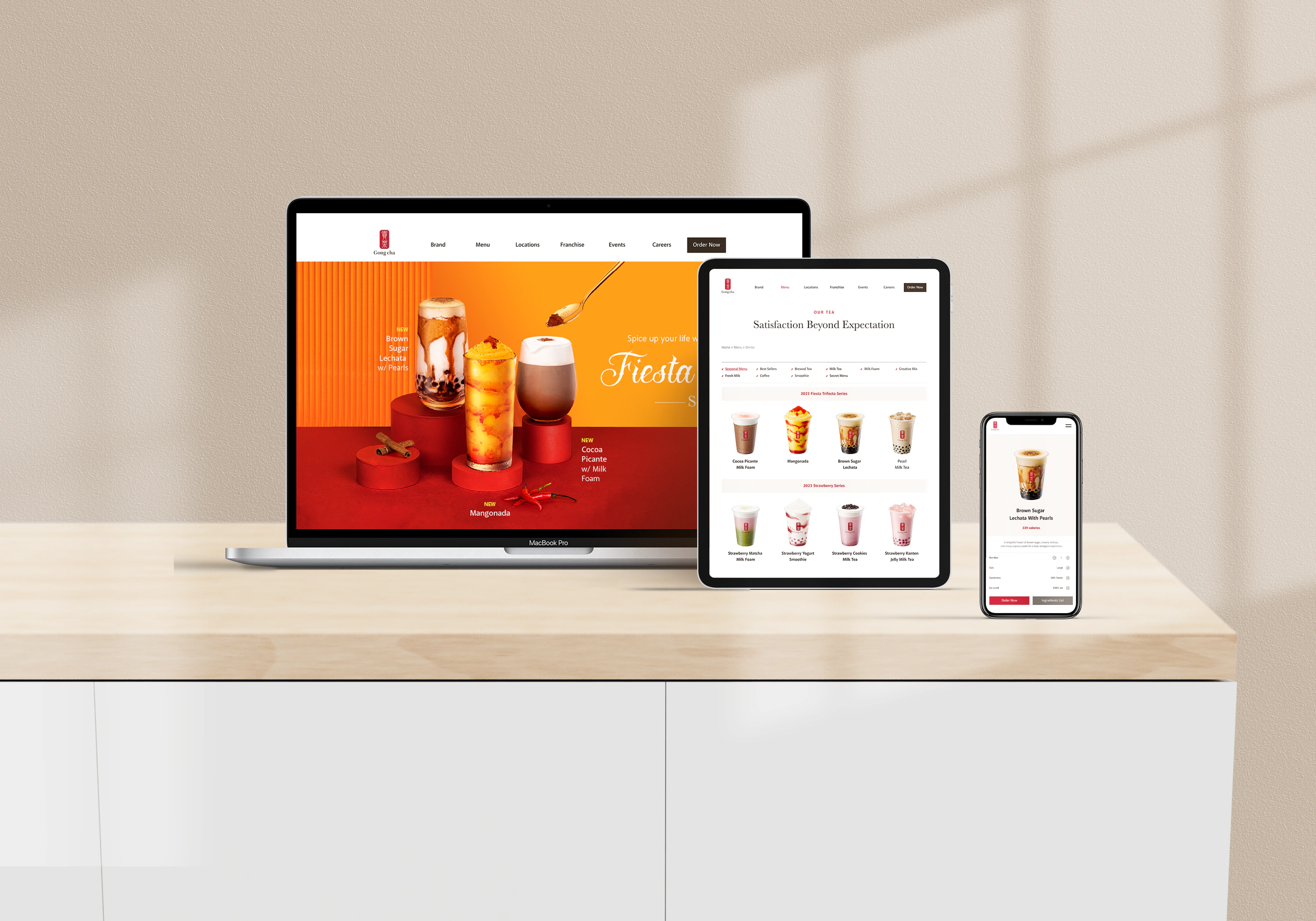
And this page practices what it preaches — semantic headings, alt text on every figure, and a keyboard-accessible image viewer.
Learn More