Overview
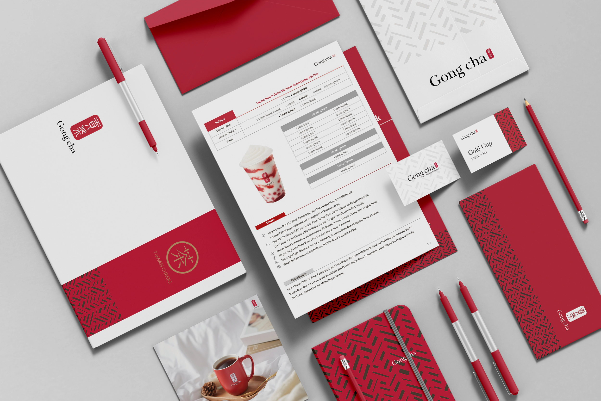
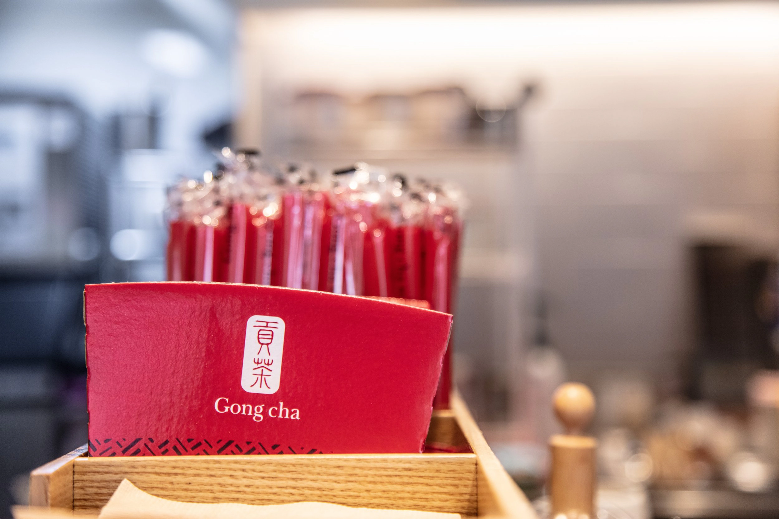
A brand identity built on Gong cha Tea Red.
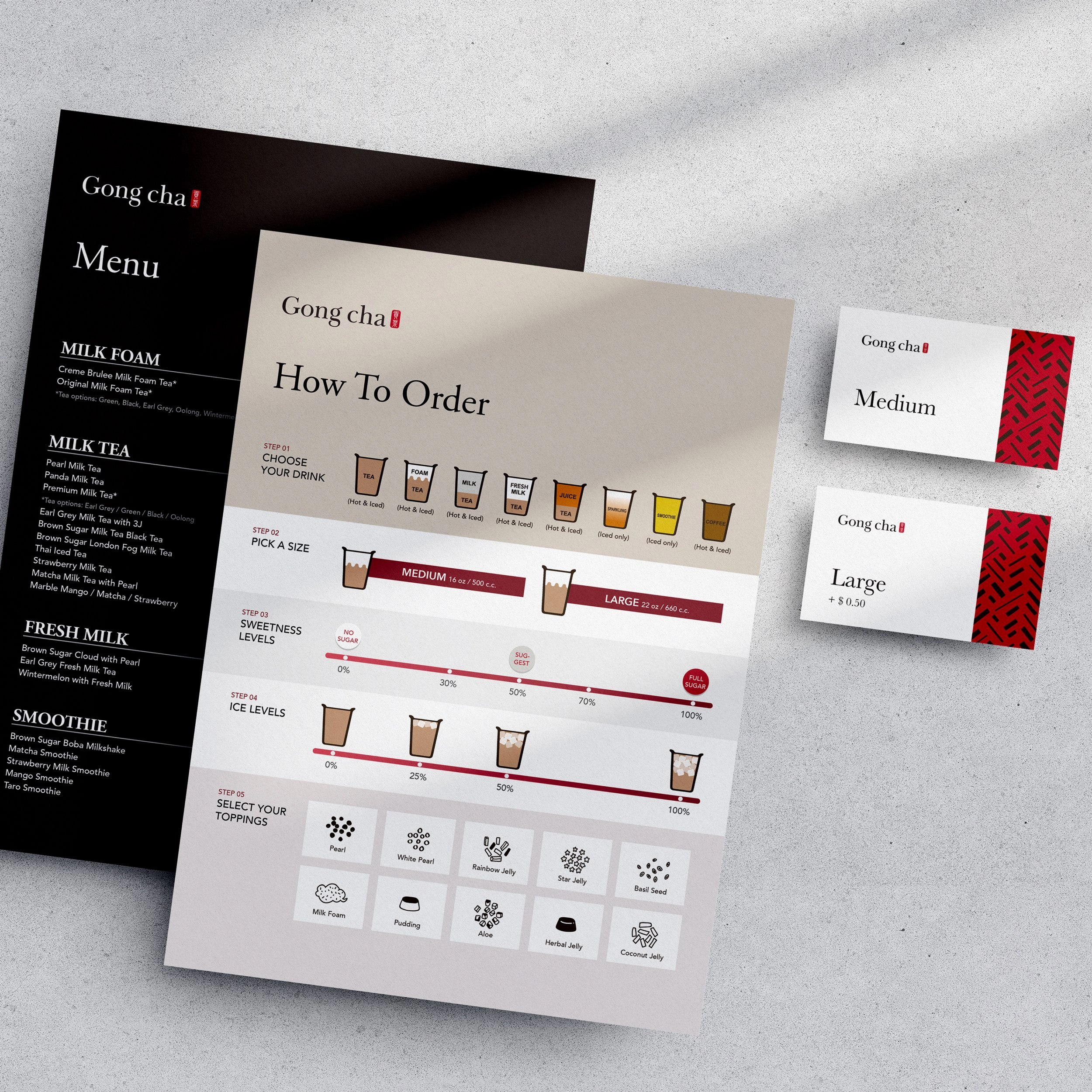
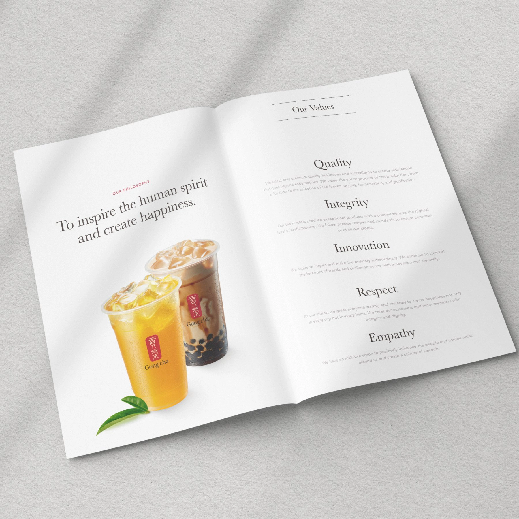
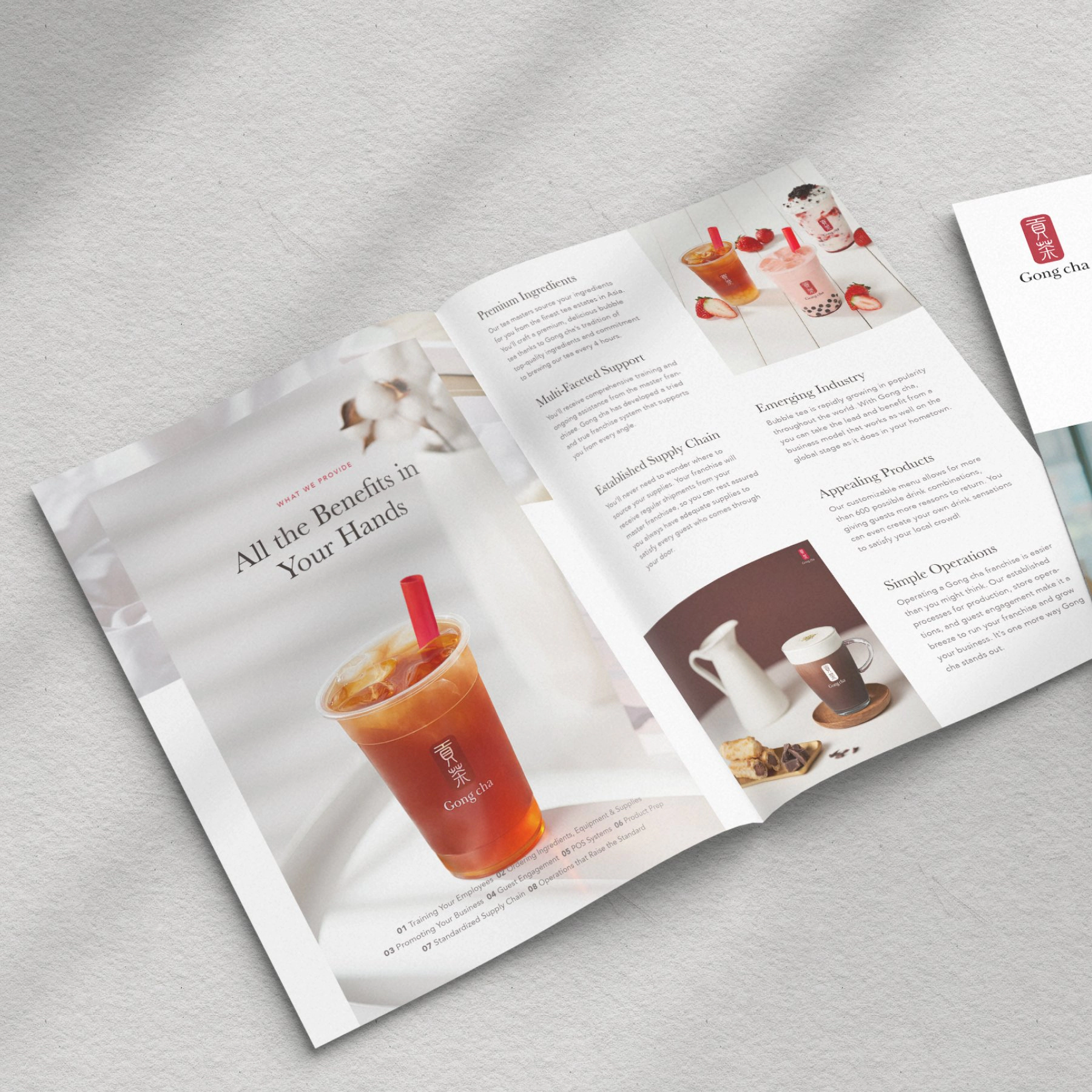
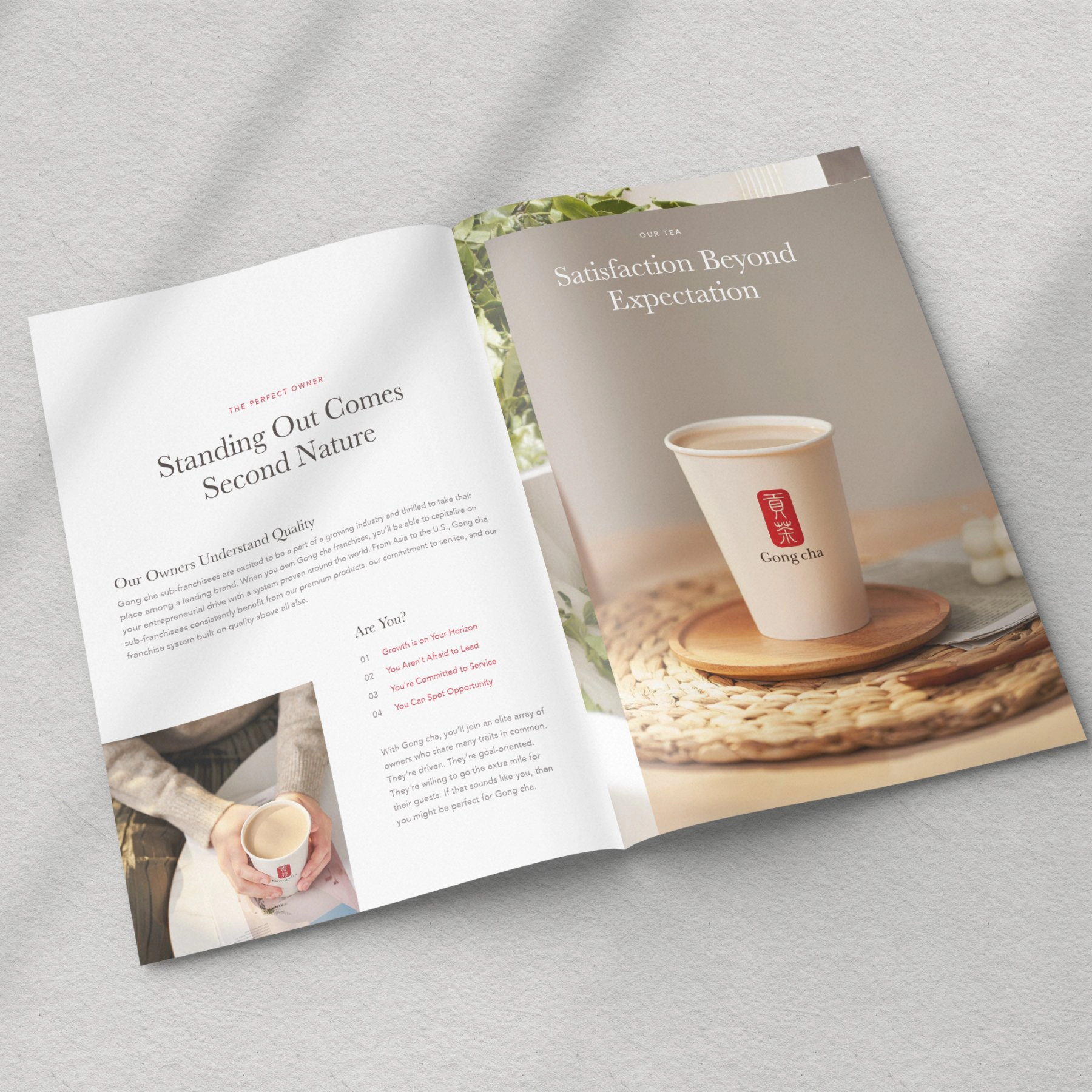
Gong cha is a Chinese term for offering the best tea to the Emperor — teas and beverages of the highest and finest quality, fit for royalty. Today the company is dedicated to the same principle of providing premium products to customers around the globe, promising to inspire the human spirit and create happiness with a perfect cup of tea. To increase brand awareness and promote tea culture, Gong cha created a series of brand materials.
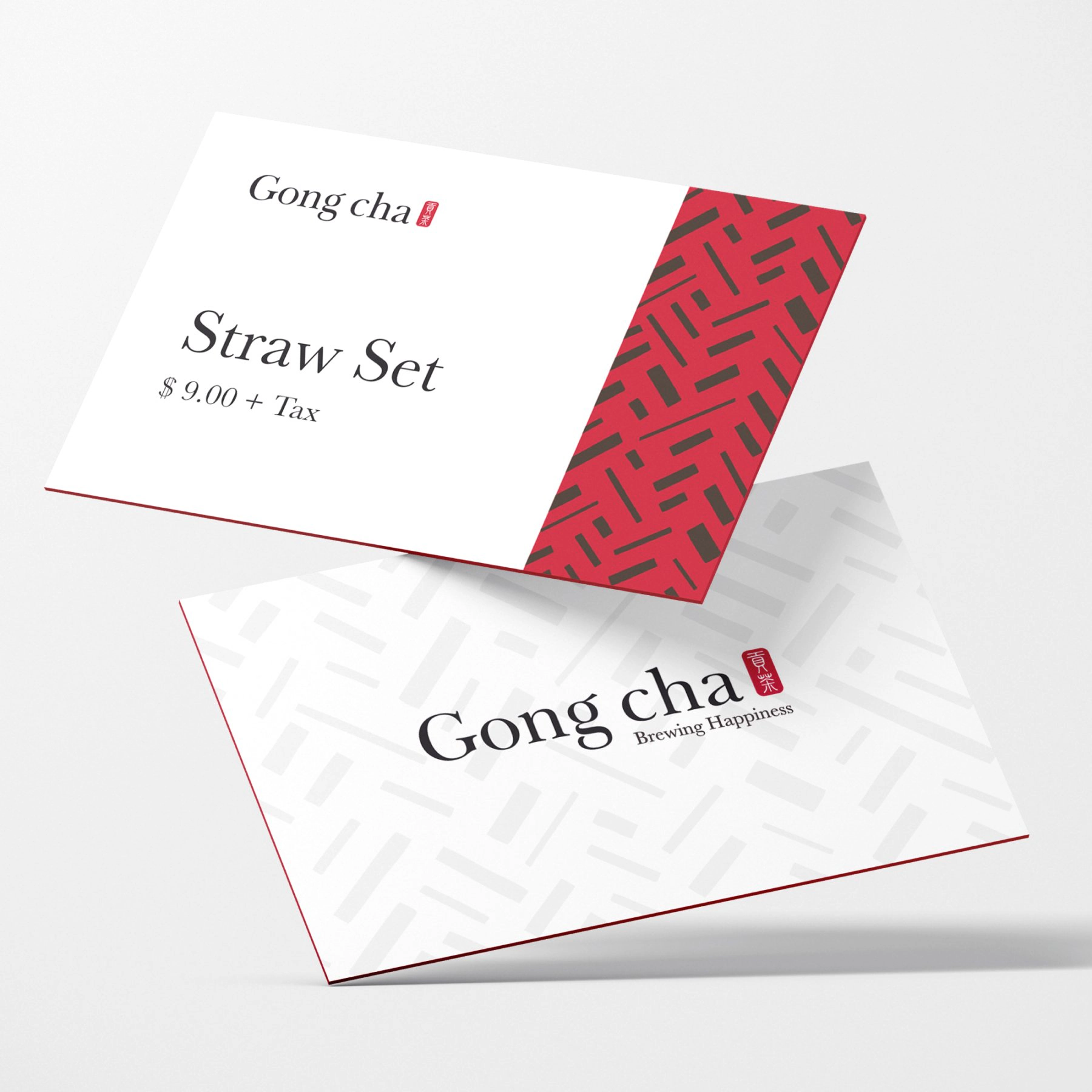
The brand identification program quickly revealed that the identity had to be modern, natural, and comfortable — conveying variety, harmony, and smoothness. The color system plays a key role: the primary color is “Gong cha Tea Red”, with Pearl Brown, Milk Beige, Leaf Green and Water Blue as secondary colors.

Recognized with the Bronze A’ Design Award in Graphics, Illustration and Visual Communication Design, 2021–2022 — awarded to the top 10% of entries worldwide. Official winner page ↗
Identity
From color system to brand materials.

In the Wild
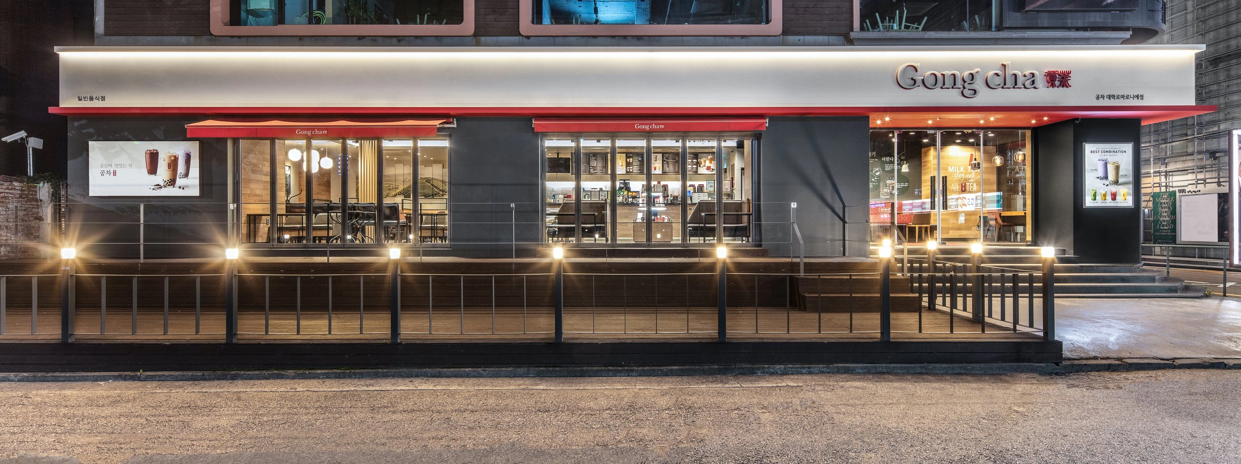
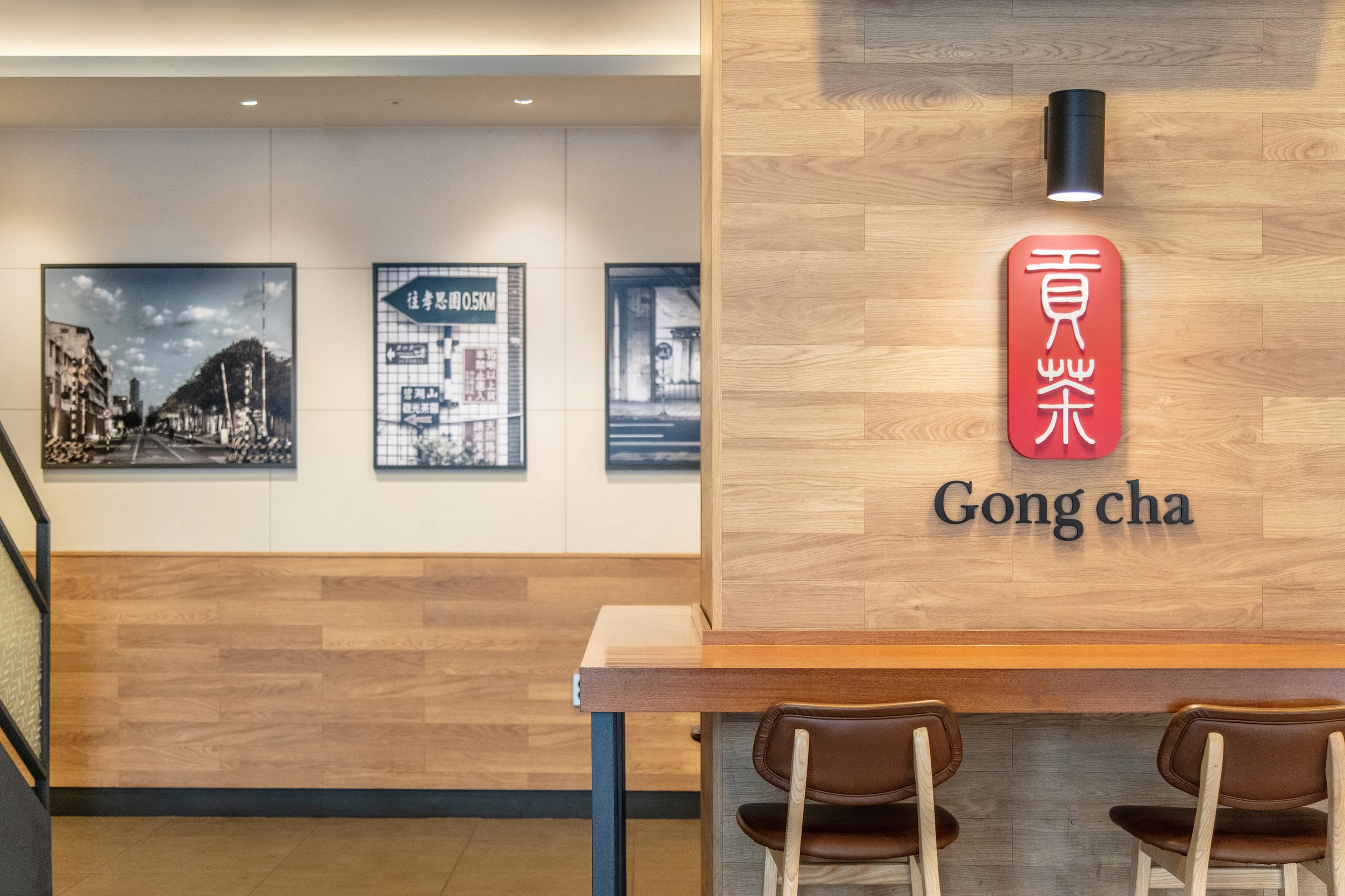
The identity, in stores.


Recognition
Bronze A’ Design Award.
Bronze A’ Design Award (2021–2022) in the Graphics, Illustration and Visual Communication Design category.
Publication
- A’ Design Award — Award Winning Designs Yearbook 2022, digital edition (co-author) · DesignerPress, Italy, 52/X · ISBN 978-88-97977-54-4