Happiness is a tap away.

Overview

Seven months from a single-store pilot to 30 stores across California.

Gong cha’s own ordering and rewards app — letting customers customize drinks and redeem points entirely on their own, and bringing business back from third-party platforms to the brand’s own channel. The project went from research to hi-fi delivery in two months and launched across the California franchise system in 2023.

Constraints: the interface had to follow Gong cha’s brand guidelines, and customization options had to align exactly with what stores can actually make — anything ordered online is something the store can deliver.

Key trade‑off: giving up the full flexibility of verbal ordering in exchange for a zero-ambiguity self-serve flow — standard customizations fully covered, edge-case personalization left to the counter.

Company
Peblla
Platform
Mobile App
Year
2023
Team
Gong cha CA Franchise
Engineering
Role
UX Research
Market Research
Prototyping
Visual Design

Problem

Heavy customization plus peak-hour lines — and reaching customers only through third-party platforms costs up to 30% in commissions while the member data never comes home.

Approach

Translate verbal customization into a zero-ambiguity structured flow, and make rewards a self-serve loop embedded in every order.

Results

30 stores in seven months, direct digital channels at 6.4% of sales, and $12K+ in points redeemed monthly.

Gong cha app home screen on a phone: points progress bar and the seasonal Peach Summer campaign
The home screen in hand — points progress on top, the seasonal campaign front and center
Hi-fi prototype walkthrough — browsing, drink customization, checkout and rewards, recorded from the interactive Figma prototype

Process

The problem

One drink, a thousand ways to order it.

Bubble tea is a high-frequency, heavily customized category: the combinations of sugar level, ice level, and toppings are different for nearly every customer, and peak-hour lines plus the communication overhead of verbal ordering directly hurt both guest experience and store efficiency. Meanwhile, a brand that can only reach customers through third-party delivery platforms pays commissions of up to 30% — and never gets to keep its own member data. Gong cha therefore wanted its own loyalty system: a promotion channel it controlled, and a points accrual and redemption system that belonged to the brand.

The first step of Gong cha’s digital journey was actually the in-store Kiosk: labor is the single largest expense in franchise operations, and the Kiosk reduced peak-hour counter staffing from two people to one — directly improving franchisee margins. Once Kiosks were in place, franchisee and customer demand shifted toward a brand-owned App.

The core question: how do you let customers complete complex drink customization and reward redemption entirely on their own — and make that experience good enough to pull them from third-party platforms back to the brand’s own channel?
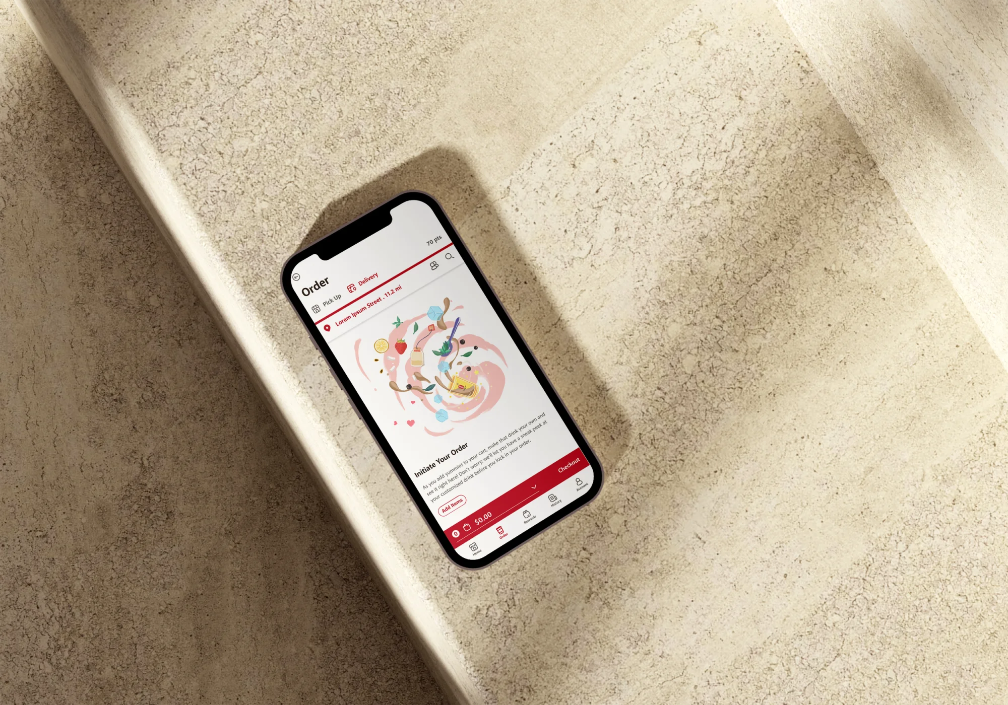
The Order page: Pick Up or Delivery in the brand's own channel, starting from an empty cart
The App’s own ordering entry — Pick Up or Delivery, both in the brand’s own channel instead of a commissioned platform

Who it’s for

Repeat customers owe you zero learning.

The App’s primary users are high-frequency bubble tea customers — young, mobile-first, with firmly established customization habits (sugar, ice, toppings), sensitive to loyalty rewards, and with little patience for lines. They don’t need to be taught how to use an ordering app — but the moment the customization options fail to match their verbal habits, or the reward rules feel confusing, they retreat to the counter or a third-party platform. The secondary stakeholders are franchisees: they care about peak-hour efficiency, member-data accumulation, and whether the reward mechanics actually drive repeat purchases.

One interview crystallized the need: a working mother of two who orders for the whole family after work — checking calories and allergens for the kids, customizing every cup differently, and feeling the pressure of the line building behind her while she negotiates it all with staff. For her, self-serve isn’t convenience; it’s relief.

Store page listing hours, distance and an order entry point
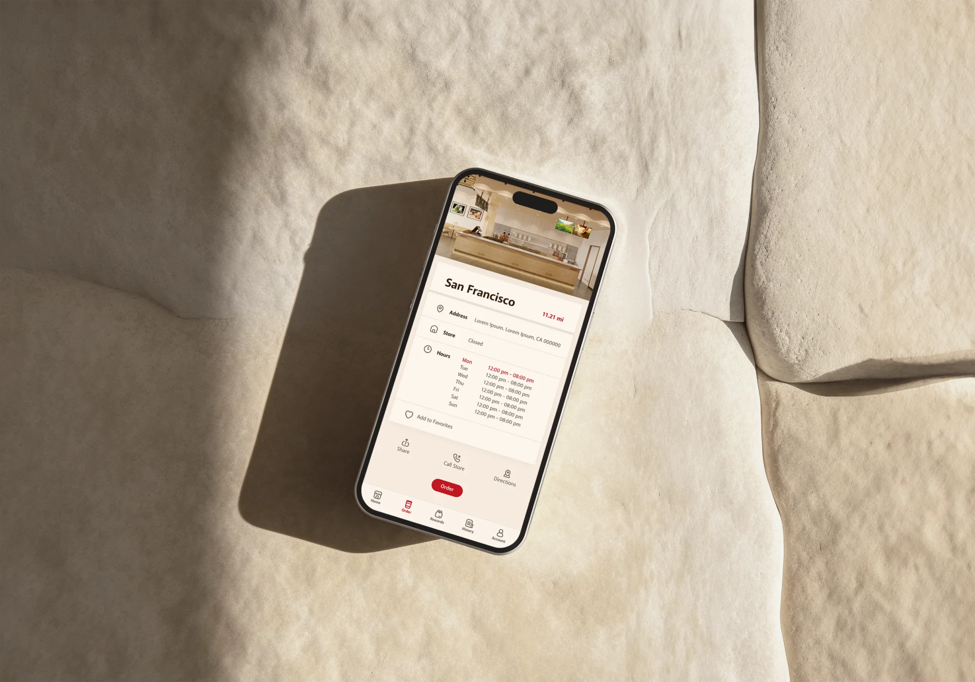
Store pages put hours and distance up front — ordering ahead is what eases the peak-hour load franchisees care about

Research

What drives repeat purchase isn’t ordering — it’s convenience plus a reward loop.

Pre-design research — a ten-question survey across four stakeholder groups (franchise owners, store managers, frontline staff and customers) plus six 30-minute 1-on-1 interviews — converged on a few key insights:

  • Users wanted an autonomous customization and redemption experience that didn’t depend on staff; 66% of customers preferred self-service over interacting with staff
  • Users’ real concerns about digital ordering: whether the system could handle complex customization, data security, and the loss of human recommendations
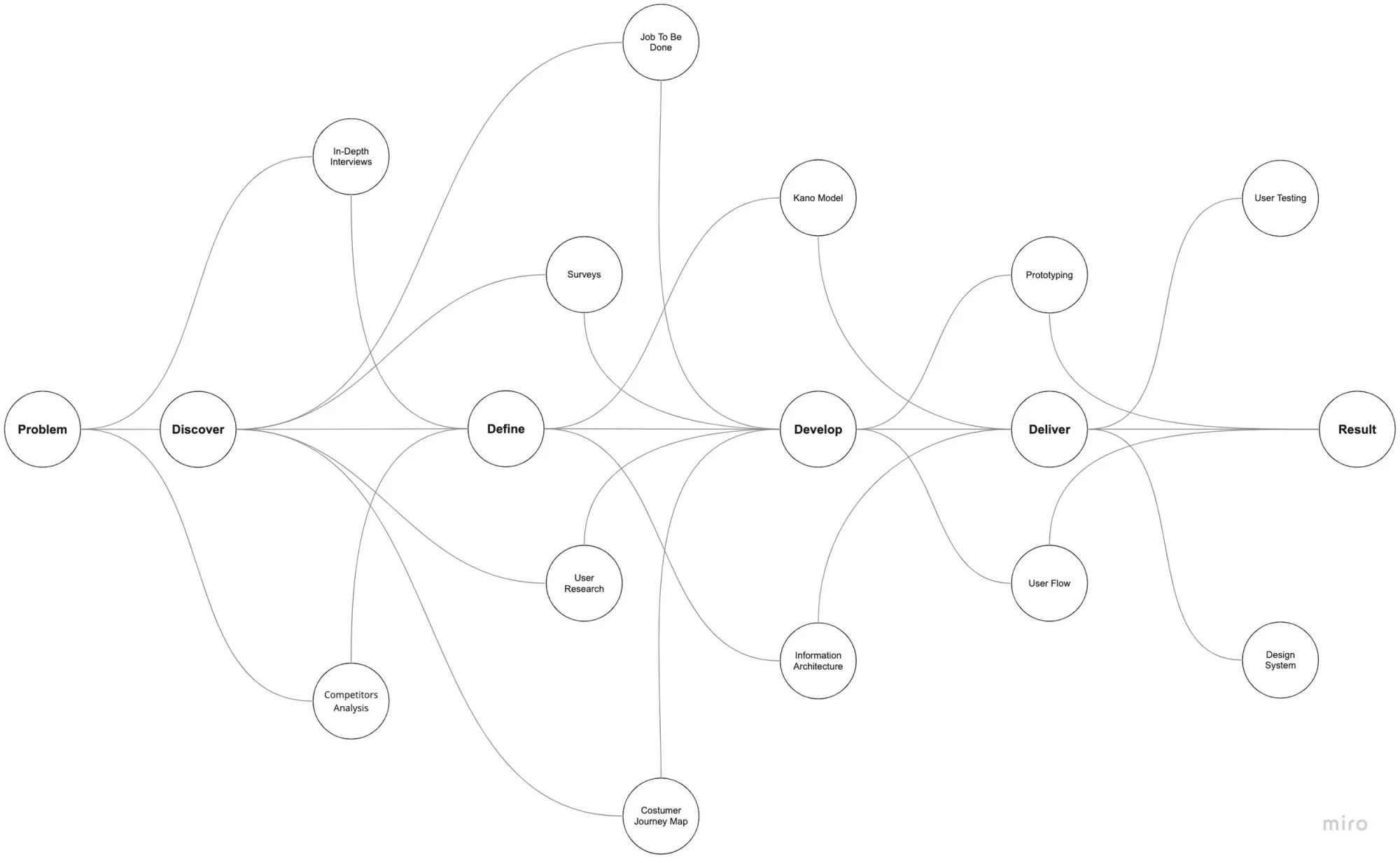
  • The competitive analysis covered three tiers — direct (Happy Lemon, Kung Fu Tea), indirect (Jamba, Yogurtland), and benchmark (Starbucks, McDonald’s): direct competitors already had their own apps, making digital ordering table stakes; the benchmarks proved that what actually drives repeat purchase is the combination of ordering convenience plus a closed reward loop
Affinity mapping of user feedback on sticky notes
User feedback, concerns and pain points clustered into core insights (affinity mapping)

The most interesting benchmark finding came from Starbucks’ channel strategy: no kiosks in stores at all, App only — turning the phone in every customer’s pocket into a “kiosk you carry with you.” But that strategy rests on coffee’s daily frequency and deeply ingrained habits; bubble tea’s walk-in, grab-and-go pattern doesn’t share those conditions. Its real value was in making one thing clear: a benchmark’s channel strategy is a product of its category conditions and can’t simply be copied — the right path for Gong cha was App and Kiosk in parallel, sharing a single membership and points system.

Full information architecture: App-side and Kiosk-side screens sharing one membership and points system
App and Kiosk as one system — the full information architecture maps ordering, membership and rewards onto a single shared backbone across both channels

Decision one

Translating verbal orders into a zero-ambiguity structured flow.

Users’ biggest concern in research was whether complex customization could survive digitization — ordering verbally, you can say “less ice, light sugar, no boba, swap in coconut jelly,” and the interface had to decompose that natural-language flexibility into structured choices across sugar, ice, and toppings: losing no options, while never letting users get lost in them. The information architecture of the customization flow became the most heavily refined part of the entire App. Structure has a cost — flexibility: verbal edge cases like “half the boba, ice on the side” can never be fully enumerated, so we covered the vast majority of standard customizations and left extreme personalization to the counter.

User flow diagram: from entry through menu, product detail and customization to checkout and order number
The ordering flow mapped end to end, from entry to order number — first drafted as the blueprint for the shared Kiosk + App system, before any screens were drawn

Decision two

Rewards aren’t a page — they’re a repeat-purchase engine in every order.

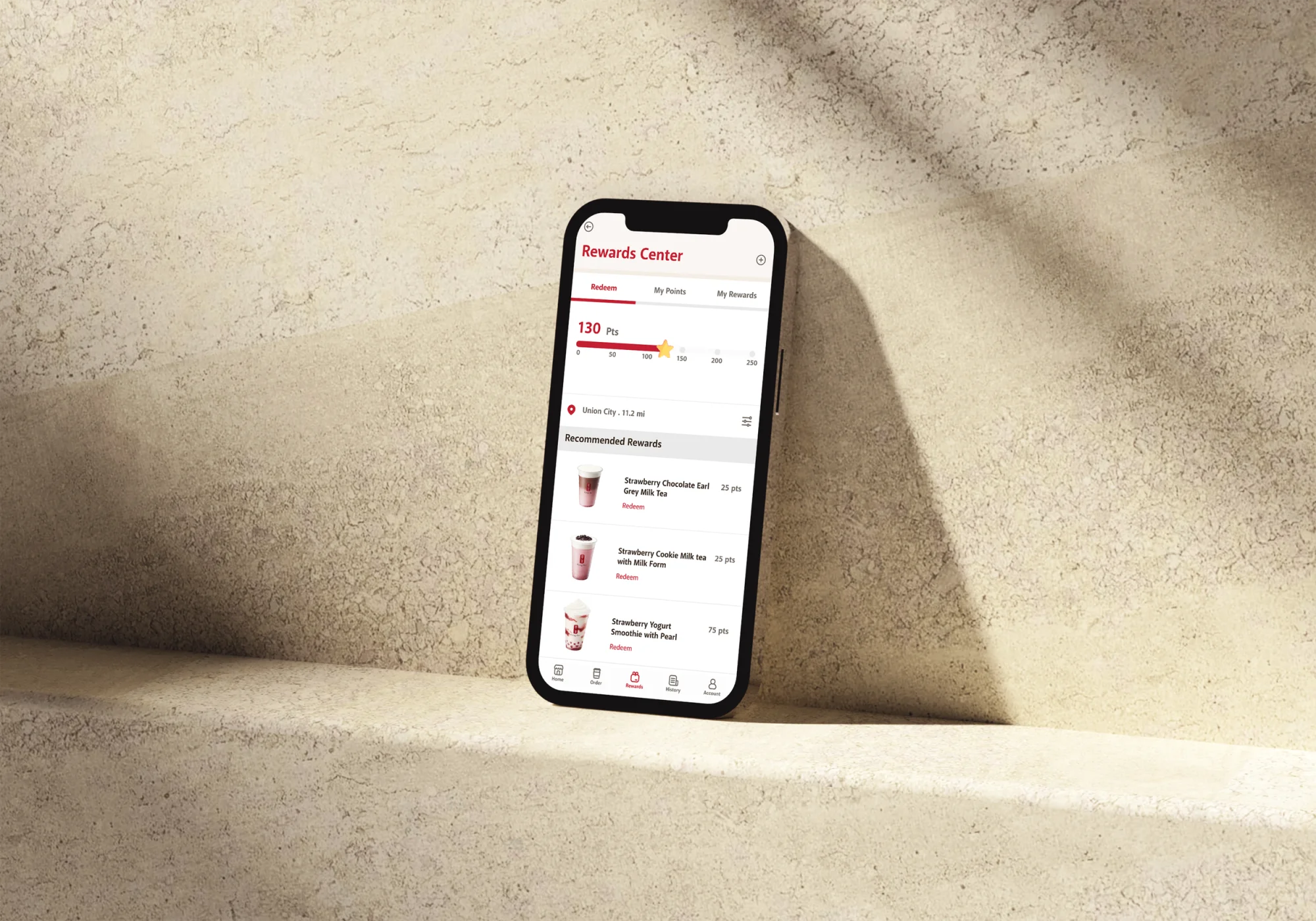
With 66% of customers preferring self-service, the reward experience had to be equally self-serve: points accrue automatically with every order, balance and history are always visible, and redemption happens inside the ordering flow itself — never requiring customers to ask staff or present any proof. The result is a “spend → earn → redeem → spend again” loop, not a sign-up-and-forget gimmick.

Reward center: points balance and redeemable rewards

Solution

Delivered along one complete ordering journey.

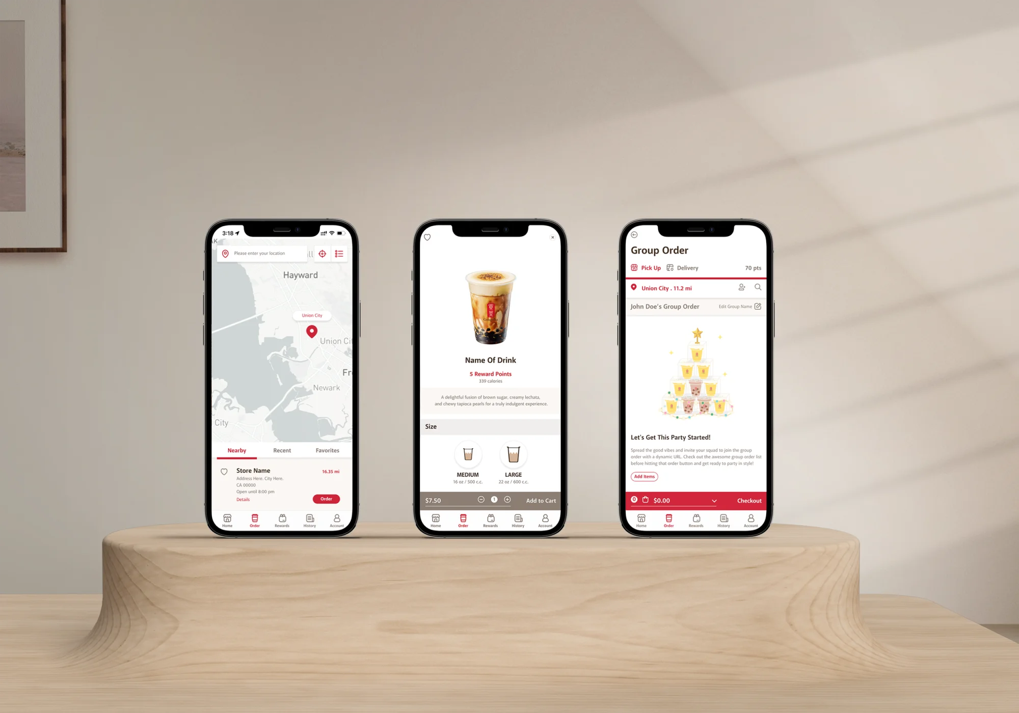
Three screens side by side: store map, product detail with size options, and a group order
The journey at a glance — find a store on the map, customize your drink, or start a group order with friends

01 Browse & recommendations

The home screen leads with large drink imagery and seasonal recommendations — turning the staff’s recommendation role into interface content.

Four lo-fi wireframes exploring different home-screen layouts
Lo-fi wireframes from the home-screen layout discussions — the competing directions we evaluated before settling on the final layout

02 Drink customization

A structured selection flow across sugar, ice, and toppings, aligned with what stores can actually make — anything ordered online is something the store can deliver.

03 Reward center

Points accrue automatically, balance and history stay visible, and redemption completes inside the ordering flow — the repeat-purchase engine embedded in every order.

04 Order & payment

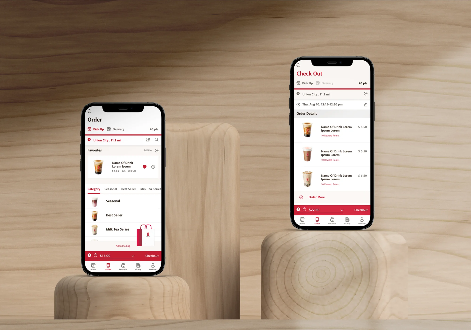
The shortest path from cart to payment, with in-store pickup to skip peak-hour lines. Group ordering is also supported — an invite link lets friends add drinks to one shared order, picked up in a single run.

Two phones side by side: the Order screen on the left, Check Out on the right

Beneath every screen above sits the same foundation — a UI kit built within Gong cha’s brand guidelines.

UI kit: color palette, Akagi Pro typography, buttons, icons and elements
The UI kit under Gong cha’s brand guidelines — palette, type, buttons and icons

Impact

A complete path from pilot to scale.

The project delivered end-to-end — from user research and competitive analysis to hi-fi prototype — within two months, and the App launched across the California franchise system in 2023. The backend data traces the full arc: in May 2023, the single-store pilot saw the App channel at just 0.85% of sales with zero points redemption; by December, App ordering was live across all 30 California stores, with ~$910K in monthly omnichannel sales across 76,136 orders.

Self-service channels (App + Web + Kiosk) together carried ~57% of sales — surpassing the counter POS and validating the core design direction that customers would complete ordering and reward management on their own. For the brand, tens of thousands of dollars in monthly sales no longer pay third-party commissions, and member purchase data stays fully in its own system — the foundation for future promotion and repeat-purchase operations.

30

California stores live

Single-store pilot May 2023 → all stores by December

6.4%

Sales via App + Web direct channels

~$58.6K/month, free of third-party commissions

$12,212

Loyalty points redeemed monthly

A reward loop customers actually used

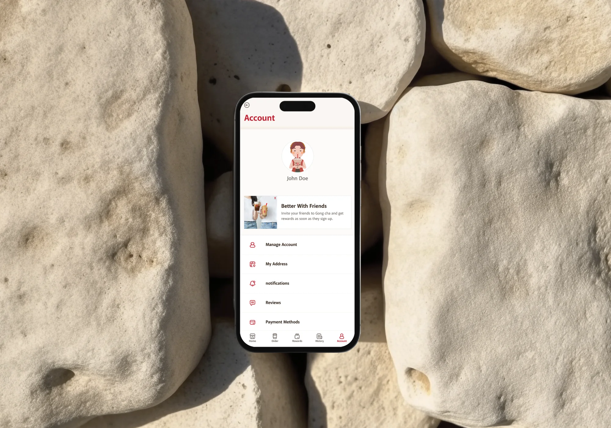
Member account screens: payment methods, notifications and preferences
The member account — where the brand’s own member relationship lives, with purchase data staying in its own system

Reflection

Category shapes channels — make the core value follow the customer.

The post-launch data taught me this project’s most important lesson. The App channel held 4% of sales while the Kiosk carried over 50% — but that’s not a failure of the App; it’s dictated by the category’s consumption pattern. Bubble tea is a grab-and-go business: walk-in traffic vastly outweighs app-based orders, so the Kiosk naturally carries the volume. The real design implication: the loyalty system has to live across channels, not locked inside the App — points earning and redemption must be fully available on the Kiosk, because rewards have to happen wherever the customer actually spends; the App’s role is to be the home of the member relationship — registration, points management, and the brand’s own promotion channel. The data also confirmed the research-phase judgment: Starbucks’ App-only strategy and bubble tea’s Kiosk dominance are opposite channel strategies for the same digital ordering — and both are right for their categories.

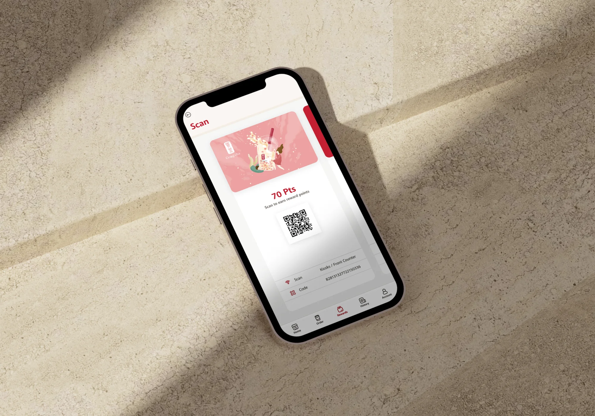
Scan page: member QR code presented at the kiosk or front counter
Scan at the kiosk or counter — rewards follow the customer into whichever channel they actually buy in

If I did this again, I’d push “reorder” much further forward in the design. The App does have one-tap reorder — but it appears only after entering the ordering flow. For high-frequency customers, the fastest order isn’t re-customizing; it’s repeating the last one. Putting “my usual, one tap” in the most prominent spot on the home screen would likely do more for the App channel’s share than any recommendation content. It’s also a reminder: for high-frequency repeat-purchase products, the real experience killer feature is rarely richer functionality — it’s a shorter path.

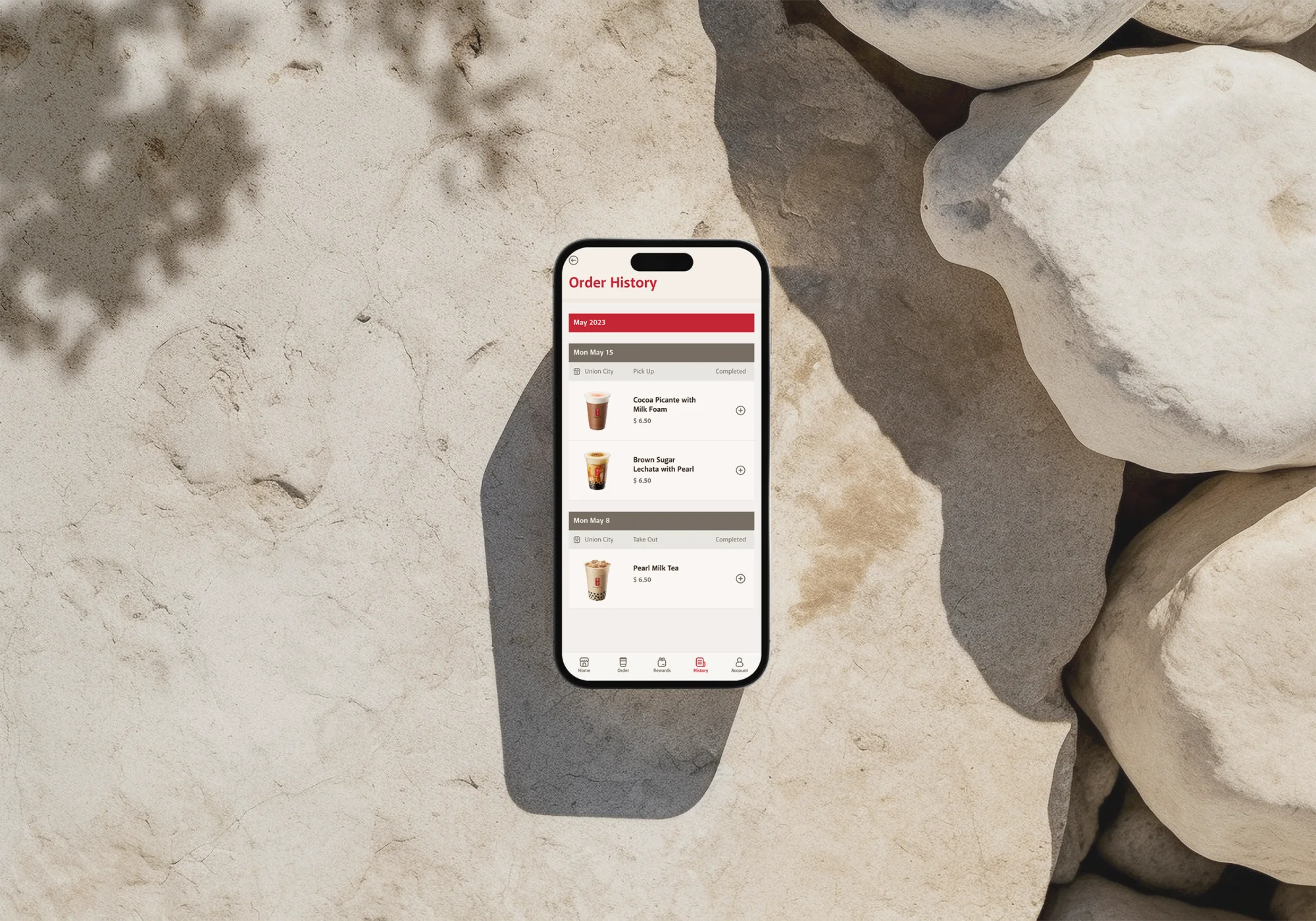
Order History screen: past orders listed by date, each with a quick-reorder shortcut
Order History — where one-tap reorder lives today; the reflection above argues it belongs on the home screen

Next

All projects